Regulatron is a web application aiming to democratize healthcare innovation. This tool allows innovators to overcome regulatory barriers to getting their products onto the market and into the hands of the people who need them.

01: Background
This project was initiated by FDA funded consortium of physicians, engineers, and regulatory experts at Stanford and UCSF.
The task was to create a practical and desirable application that would help researchers to classify their inventions. The Client hired me to formalize user research and create a clickable low- to mid-fidelity prototype that he would use to test the product.
My task was to create an MVP prototype for medical device searching service.
The idea was that the User describes the device and get the list of similar devices. It gives a picture of what regulations apply to similar devices. Also, it was important to show how the results vary based on small changes.It was a two-week project that included empathizing with users, sketching the flows, and finding the solution processes.

02: Research
To understand the Users' context of interaction and discover possibilities, I decided to learn about users, so I worked on understanding who is the persona.
I discovered three main categories of users, which were a senior student of Standford who has a year-long project where she needs to invent the concept of medical device and provide the classification, the bioengineer who classifies 30-50 devices/year, and an international inventor who looks for requirements for her invention to get to the US market.


The next step was to create storyboards to identify and remember which features are necessary for Users to complete the scenario.
That helped identify issues and reveal the key screens.I started with planning out the steps of scenarios and understanding the emotional state of the User on each sequence. Then I draw the visuals and polished the captions.

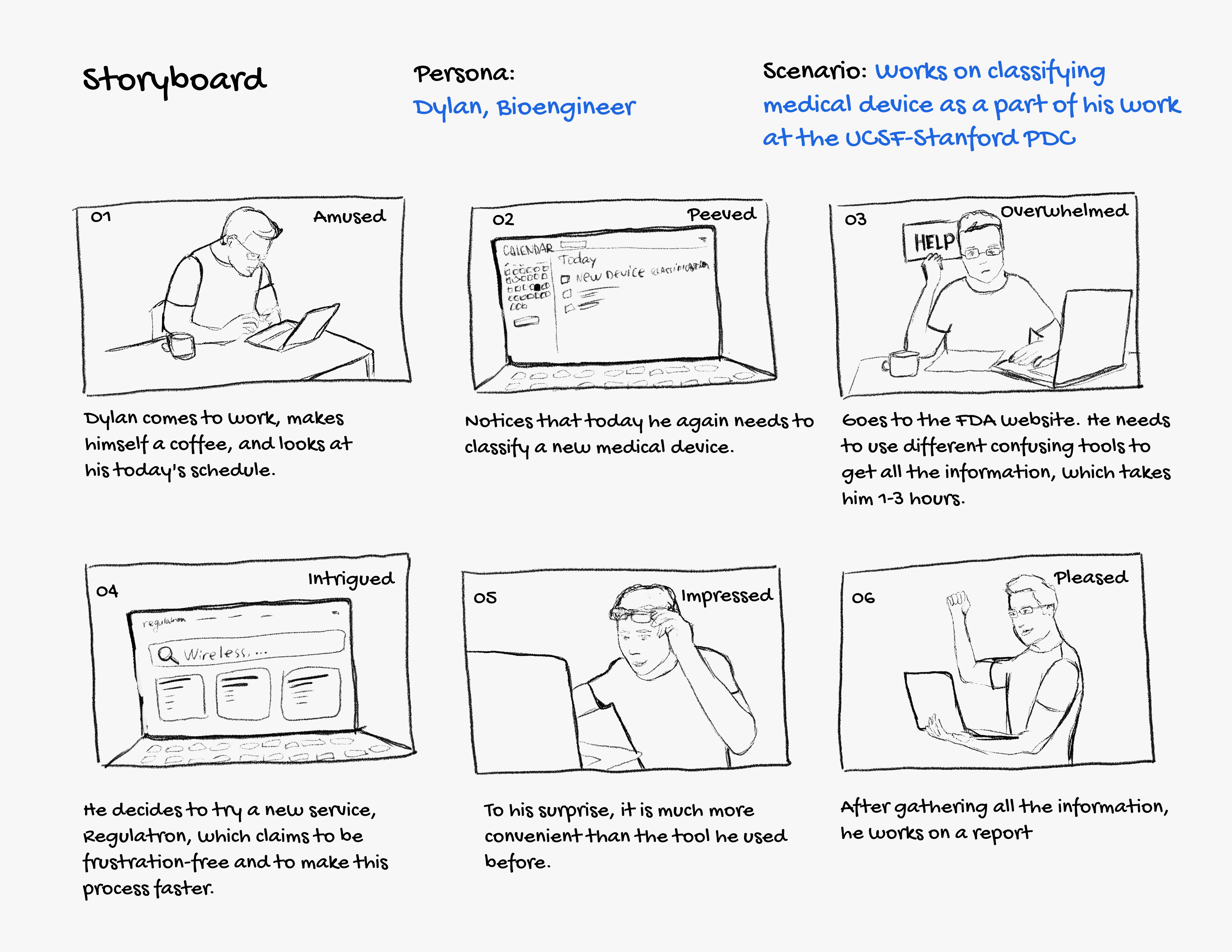

The issues I identified
It was essential to see a lot of cards at once as it gives the whole picture of devices on the market.It was important to have an Export to Excel button, as most users would need to export the information to their spreadsheets.
03: Sketching
Low-fidelity wireframes

The first round of feedback revealed
1. Simplifying and visualizing complex data: the amount of information should be simplified and be arranged to understandable data visualization.
2. Adjustable search box: I had to find the solution for the search box containing approximately seventy words on average, so the User could see how results change depending on changes in input.
3. Dropdown for sorting: I started with tabs, but the feedback showed that it wasn't clear, so I needed to change it to a more used pattern, a dropdown.
04: Finding the solution
After testing the initial paper wireframe, I started to get together mid-fidelity elements of the design.
After testing the initial paper wireframe, I started to get together mid-fidelity elements of the design. On this step, I found the solution to simplify the unsorted table, which was showing two different view options for summary information we had: visualization and table view.
Defining complex data
So I decided to transform the table into a simple data visualization. That allowed me to create visual-pleasing graphics that can be toggled to a classic table view, so Users can pick the most convenient way to see the data.

The visualization elements have tooltips that explain the meaning of information, and also, the User can switch to a table view, which consists of more rough info.
Designing a big search box
The User needed to have seen how the results change depending on the search request. The solution was to make small control in the corner of the search box, allowing the User to change the box's size manually. That allowed the User to decide the size of the search.

Cards design and interactions
To make search results more scannable, I decided to replace tables with cards, which shows the essential information and expands to a full view. The cards have five states: inactive, hover, selected, expanded, and expanded selected. The User can switch between cards using a keyboard or cursor.
Cards order changes depending on the chosen sorting method.
05: Prototyping
Creating ready to test design
Prototype creation was an essential step of the process as the Client's initial assignment was to get ready to use clickable design to test it out. The insights I got from rapid prototyping:
– Ones more, I understood that real-time prototyping is a win-win as I could define design problems right away on the sketching phase.
– It helps to identify semantic issues such as card sorting: initially, I went with tabs for sorting, which was confusing.
The prototype, you can click through ⤵
06: Next steps
Usability testing
Although this product's idea is great, it still requires iteration and polishing the user experience. The next step would be to test the prototype on real Users and see how that works for them and what we can improve.
High-fidelity mockups
I hope that the Client would proceed with this project and transform it into a real-world product. I would love to participate in developing and refining the final product.